InternetNewsTech

Meta Changed Facebook Branding, and There is No Major Difference At All

0
Meta Changed Facebook Branding, and There is No Major Difference At All

Meta has changed Facebook’s brand identity/logo, and there is hardly any difference. It is precisely the same logo as the previous one.

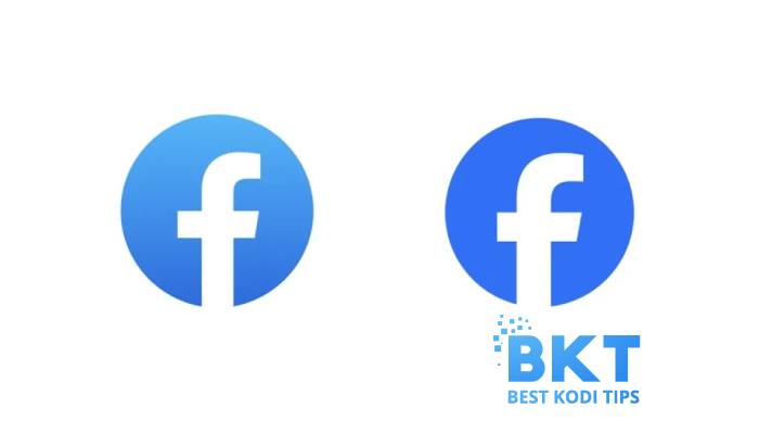
The only difference is in color; the new logo has a darker blue color and minor tweaks to the ‘f’ character.

Below, we have shared the images of the latest and old logos; please let us know if you feel any difference.

On the Left Side (Old), Right Side (New) Logo

Meta has explained the changes in the new logo in their blog post. In their blog post, Meta Meta stated that they intended to make a new, refreshed design of the Facebook logo that was bolder and everlasting.

The blog post further noted that the new logo is a “more confident expression of Facebook’s core blue color.”

Masri
Masri serves as the Chief Content Editor at BestKodiTips. With three years of experience, she excels in creating technical content, focusing on how-to guides, Android and Kodi tutorials, app reviews, and addressing common technological challenges. She ensures to stay abreast of the latest tech updates. Outside of work, Masir finds pleasure in reading books, watching documentaries, and engaging in table tennis.

    Microsoft AI Team Accidentally Leaked 38 Terabytes of Sensitive Data

    Previous article

    Meta Offers Paid Blue Tick Badge for Business Accounts

    Next article

    You may also like

    Comments

    Comments are closed.

    More in Internet